Post by Mandy McAvoy on Dec 10, 2012 8:24:58 GMT -5
10 TIPS FOR REALISTIC PHOTO EDITING

Photo quality is a big deal in the forum nowadays. Not only in order to have fancy pictures to show off in your albums, but also in competitions around in the forum. The photo quality isn't only decided by the resolution of your screenshots and pixelation and all that. It's also decided by the amount of detail and realism put in the photos. Several people, me among them, have an eye for detail and can sense how the smallest (and perhaps almost invisible details) add a lot of depth and life t the photos. A lot of people have asked of me to make a tutorial in order to share a few tips of how to improve the realism of your photos. So - enjoy! Hope it helps:)
And keep in mind: I've not made this tutorial to teach people how to use Photoshop. I assume that people already know how to use Photoshop before reading through this tutorial.
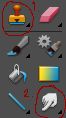
Here is a pic showing you my most beloved tools: 1. Clone Stamp Tool and 2. Smudge Tool. I will refer to these tools throughout the tutorial.
1. MAKE A CHECKLIST
Why have a checklist? Because it guarantees you to remember to add the same tack etc. to all of your pictures. I notice very quickly if people add some kind of tack in one of their 5 competition pictures and suddenly forget to add this same piece of tack in all of the 5 pictures. If you look at it with realistic eyes, it is highly unlikely that the rider and horse put on more tack between the distance from one jump to another during a showjumping course;)
2. PATCHING POSE ERRORS
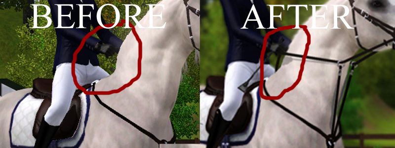
When using poses and CC, a lot of the poses can cause minor errors. An example is that the poses make the horses' necks bend and curve in quite weird ways. This is not very pleasing to the eye, and it looks very unnatural. Use the Clone Stamp Tool to patch up this "hole".
3. PATCHING TACK
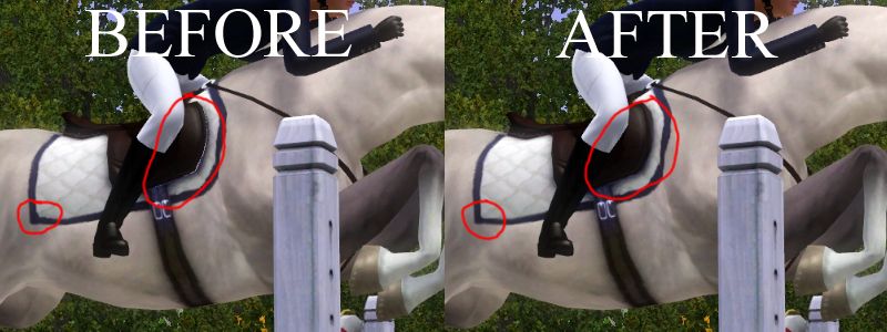
The saddles and saddle pads leave small texture errors that are better to disguise. Use the Clone Stamp Tool and soften the patched areas afterwards with the Smudge Tool. This can also be done on bridles and breast collars that also need patching.
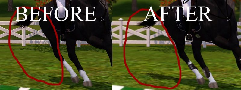
4. SHADOWS
In sunny pictures, the appearing shadows add a nice touch to the photos. Painted tack, however, does not leave shadows since it was not present in-game. Adding some shadows on the horse behind the reins etc. really adds realism to the photos. Another thing is that not all in-game objects leave proper shadows. Not all poses (perhaps none?) leave proper tail shadows. Make sure to add some shadows where it should have been.
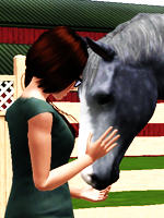
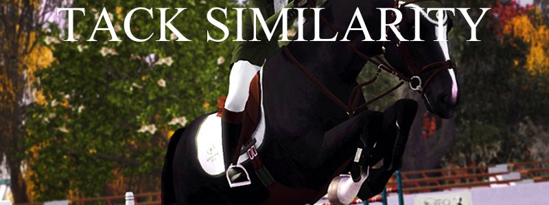
5. TACK SIMILARITY
I do not say that ALL pieces of tack used on a horse have the same colors, but you usually see a similarity in tack colors. In RL, you usually buy dark brown martingales if you already have a dark brown bridle. But it is also perfectly normal to have tack of slightly different colors. Just be smart about the tack color choices - people notice when you have and when you haven't. Here's an example of tack alikeness, and also an example of how some pieces of tack can be of different color without bringing disturbance to the pictures. Look at how the saddle is lighter than the rest of the tack - this is natural as far as realism is concerned.
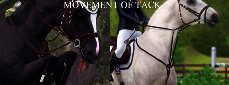
6. MOVEMENT OF TACK
When painting on tack, keep in mind that RL tack moves and flows with gravity and speed. It is highly unlikely that the tack will move stiffly around over every single jump during a showjumping competition. Make sure to think of how the horse's body can affect the movement, as well. At the picture below, you can see that the reins shape their way alongside the curved and muscular neck of the horse. The martingale straps move randomly around. You can also see how a stretched neck of the horse can make the reins and martingale straps stretch as far as they can, and therefore also affecting each other.
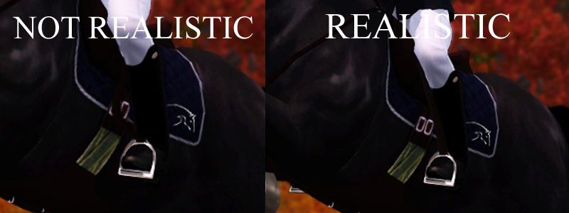
7. STIRRUP STRAPS
I find that some of you sometimes forget that the weight of the rider should be in the stirrups when showjumping. As far as realism is concerned, you may have "accidents" where the rider loses his or her balance and can't properly keep weight in the stirrups. Anyway, try to remember that it is important when you present your showjumping competition pics that your rider should have proper weight and balance in the stirrups. Therefore, make sure the stirrup straps are straight. They shouldn't hang around loose like some snake.
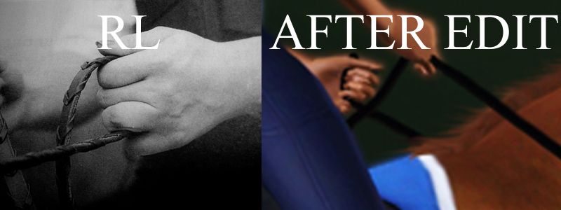
8. HOLDING THE REINS
How to hold the reins? In English riding, the reins shall be held like the picture demonstrates below. Try to replicate this in your pictures. Even if you barely can see it, eyes like mine will definitely see if you intended the reins to be like this;)
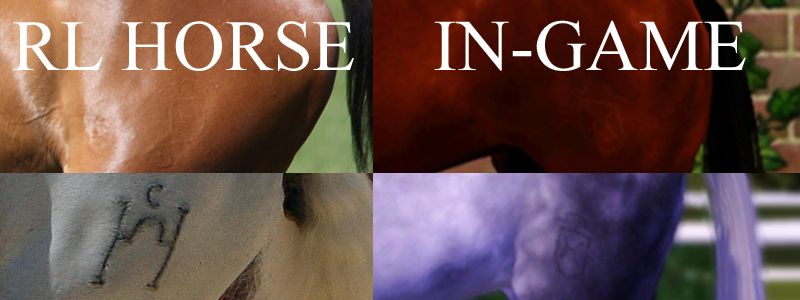
9. BRANDING YOUR HORSE
When puttin brands on your horses, remember to keep them discrete. I'm not saying that ALL horse brand marks are barely visible, but most are, especially when the horse have an unshaved summer coat. It is, however, perfectly normal and natural that brands show up more clearly on some horses than others. This can especially be said about grey horses - grey coats tend to have more clear brand markings. Here is an example of two horses. The brown is my RL Holsteiner who's brand is barely visible. The other is a random RL Pura Raza Española with a very clear brand marking. Keep this in mind when making coats as this is a clear indicator of understanding for realism.
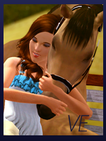
10. WEARING TACK
Do not forget that the tack used in for example showjumping competition picture 1 out of 5 must also be used in the other pictures. You do not stop during the course to take off certain pieces of that. Also, remember what side on the horse the tack should be on. Below you see a picture of my sim holding a whip during a show. See that she holds the whip in the same hand in both pics? The whip might not be as visible on both pictures, but it most definitely adds depth and most of all - REALISM - to the pics:)
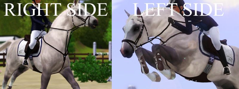
Photo quality is a big deal in the forum nowadays. Not only in order to have fancy pictures to show off in your albums, but also in competitions around in the forum. The photo quality isn't only decided by the resolution of your screenshots and pixelation and all that. It's also decided by the amount of detail and realism put in the photos. Several people, me among them, have an eye for detail and can sense how the smallest (and perhaps almost invisible details) add a lot of depth and life t the photos. A lot of people have asked of me to make a tutorial in order to share a few tips of how to improve the realism of your photos. So - enjoy! Hope it helps:)
And keep in mind: I've not made this tutorial to teach people how to use Photoshop. I assume that people already know how to use Photoshop before reading through this tutorial.
Here is a pic showing you my most beloved tools: 1. Clone Stamp Tool and 2. Smudge Tool. I will refer to these tools throughout the tutorial.
1. MAKE A CHECKLIST
Why have a checklist? Because it guarantees you to remember to add the same tack etc. to all of your pictures. I notice very quickly if people add some kind of tack in one of their 5 competition pictures and suddenly forget to add this same piece of tack in all of the 5 pictures. If you look at it with realistic eyes, it is highly unlikely that the rider and horse put on more tack between the distance from one jump to another during a showjumping course;)
2. PATCHING POSE ERRORS
When using poses and CC, a lot of the poses can cause minor errors. An example is that the poses make the horses' necks bend and curve in quite weird ways. This is not very pleasing to the eye, and it looks very unnatural. Use the Clone Stamp Tool to patch up this "hole".
3. PATCHING TACK
The saddles and saddle pads leave small texture errors that are better to disguise. Use the Clone Stamp Tool and soften the patched areas afterwards with the Smudge Tool. This can also be done on bridles and breast collars that also need patching.
4. SHADOWS
In sunny pictures, the appearing shadows add a nice touch to the photos. Painted tack, however, does not leave shadows since it was not present in-game. Adding some shadows on the horse behind the reins etc. really adds realism to the photos. Another thing is that not all in-game objects leave proper shadows. Not all poses (perhaps none?) leave proper tail shadows. Make sure to add some shadows where it should have been.
5. TACK SIMILARITY
I do not say that ALL pieces of tack used on a horse have the same colors, but you usually see a similarity in tack colors. In RL, you usually buy dark brown martingales if you already have a dark brown bridle. But it is also perfectly normal to have tack of slightly different colors. Just be smart about the tack color choices - people notice when you have and when you haven't. Here's an example of tack alikeness, and also an example of how some pieces of tack can be of different color without bringing disturbance to the pictures. Look at how the saddle is lighter than the rest of the tack - this is natural as far as realism is concerned.
6. MOVEMENT OF TACK
When painting on tack, keep in mind that RL tack moves and flows with gravity and speed. It is highly unlikely that the tack will move stiffly around over every single jump during a showjumping competition. Make sure to think of how the horse's body can affect the movement, as well. At the picture below, you can see that the reins shape their way alongside the curved and muscular neck of the horse. The martingale straps move randomly around. You can also see how a stretched neck of the horse can make the reins and martingale straps stretch as far as they can, and therefore also affecting each other.
7. STIRRUP STRAPS
I find that some of you sometimes forget that the weight of the rider should be in the stirrups when showjumping. As far as realism is concerned, you may have "accidents" where the rider loses his or her balance and can't properly keep weight in the stirrups. Anyway, try to remember that it is important when you present your showjumping competition pics that your rider should have proper weight and balance in the stirrups. Therefore, make sure the stirrup straps are straight. They shouldn't hang around loose like some snake.
8. HOLDING THE REINS
How to hold the reins? In English riding, the reins shall be held like the picture demonstrates below. Try to replicate this in your pictures. Even if you barely can see it, eyes like mine will definitely see if you intended the reins to be like this;)
9. BRANDING YOUR HORSE
When puttin brands on your horses, remember to keep them discrete. I'm not saying that ALL horse brand marks are barely visible, but most are, especially when the horse have an unshaved summer coat. It is, however, perfectly normal and natural that brands show up more clearly on some horses than others. This can especially be said about grey horses - grey coats tend to have more clear brand markings. Here is an example of two horses. The brown is my RL Holsteiner who's brand is barely visible. The other is a random RL Pura Raza Española with a very clear brand marking. Keep this in mind when making coats as this is a clear indicator of understanding for realism.
10. WEARING TACK
Do not forget that the tack used in for example showjumping competition picture 1 out of 5 must also be used in the other pictures. You do not stop during the course to take off certain pieces of that. Also, remember what side on the horse the tack should be on. Below you see a picture of my sim holding a whip during a show. See that she holds the whip in the same hand in both pics? The whip might not be as visible on both pictures, but it most definitely adds depth and most of all - REALISM - to the pics:)